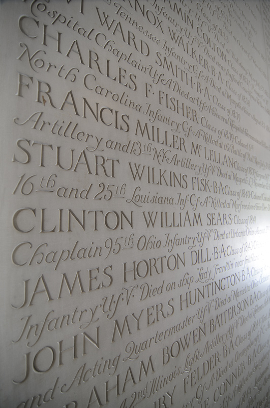
Just a small number of the names of those that died in service to our country. Yale University.
Notice the blown out highlight on the right side of the image. Some pixel peepers would say that you should not have blown out highlights in a photo and that blown out highlight makes this a not-so-good image. I disagree. In my digital darkroom, I reduced the exposure and highlights so that the text could be seen in this highlight area. I did not like that version of the photo nearly as much as this version. This one simply looks better. Maybe it's because some of the names fading into nothingness has a certain significance. Maybe it's because of the bit of mystery leaving out this print invokes. Maybe it's simply because this version of the image looks better.
Make sure that you always make images that you yourself enjoy.